

Aquaguard is one of India’s strongest and most memorable brands. Known for bringing new technologies, the brand is associated with key values of innovation and trust.
Classic was an iconic product that helped launch the story of UV technology through its dual-cylinder design format two decades ago. The form was reminiscent of the legacy of the brand but represented a technology that was clearly associated with the past. What the brand needed was a new edge that represented the future. A design language that was contemporary and yet close enough to the legacy of the brand that it helped build.
Dr. Aquaguard Classic+ , was designed by Future Factory as a modern interpretation of the 21-year-old, best-selling water purifier. The design built relevance by likening it to the contemporary and rapidly evolving aesthetics of Indian homes, while maintaining its legacy. Classic + supports a mineral guard that increases level of calcium and magnesium minerals to promote a healthier lifestyle, re-iterating the value of trust. Lastly, it is made with a unibody plastic, keeping it recycle friendly and discouraging surplus wastage, reflecting the new values of the future around sustainability and environmental consciousness.
| Product | Classic+ |
| Industry | Consumer Goods |
| Scope |
|

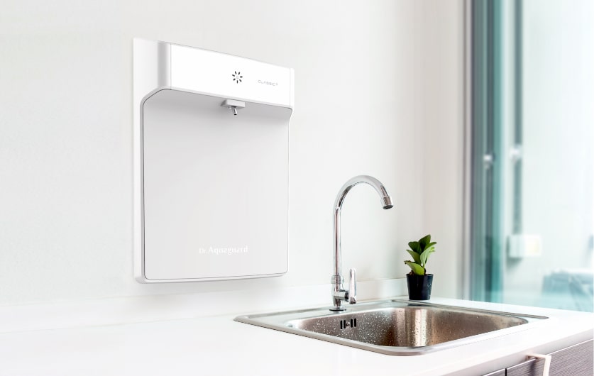
Classic+ was designed to be the world's first in-wall water purifier. Functional components are mounted on the rear casing that goes inside the wall, giving the front panel a flush, sleek and futuristic aesthetic. This is in sharp contrast to the cluttered look that is typical of kitchens using existing devices. Classic+ blends in seamlessly while saving space in a typical Indian household, reflecting the new aesthetics of Indian homes and the aspiration of an upscale living style offered by high end appliances.
The optimised arrangement of components enabled the team to create a particularly slim, compact and sleek product. The neutral colour palette reinforces its clean and minimal design language. It’s chamfered edges form a sort of bevel that creates the right balance between a simple appearance - which is the prerequisite for durability - and greatest possible ease of use.

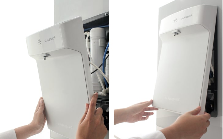
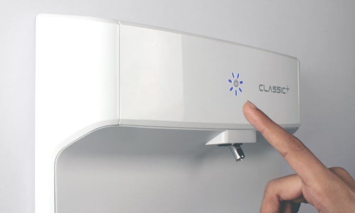
The interface of Classic+ is minimal just like its form, featuring a one-point operation. It requires minimum effort from the user and is simplified to avoid any complications. The blinking LED indicator integrated with a CapSense button intuitively signals the activation, the status of operation and the service requirement of the device. The product assembly allows for quick and easy servicing through the removal of its front casing, that is held onto the main body using discreet button magnets. This ensures an effortless, tool-free and ergonomic service. The launch of Classic + was unprecedented in the high level of new product acceptance and excitement expressed by trade and the salesforce. The product went on to win the prestigious Red Dot Product Design award, one of the highest accolades for the design of modern day appliances.
Future Factory helps deliver business impact through design. Contact us for more information on how we can help.
Do you want to create transformation change through design? Read more about open positions.
We actively engage in conversations and help build interesting points of view. Sign up to join our community.